Email data good practice

One of many problems with email marketing is deliverablity – getting your emails into inboxes. Sure, once they’re there then we start to worry about open rates and click rates, but before that we need to get the emails in there right? Companies have been experimenting with different ways to clean their data to ensure high deliverability rates.

One-off data cleansing emails is bar far the most common way to clean your data. There are other techniques: including your registered email address in the footer of the email to see or the company sends an email to its list with a unique account access links which enable the subscribers to enter their account and update their details. Most subscribers are lazy and I suspect would rather sign up with a new email address than update their old email.

IAB are smart! (I’m sure this isn’t ground-breaking)

They sent their IAB Smartbrief newsletter to me today, but this time when I tried to access a story I was re-directed to a ‘Update your details’ page first – ‘Update details now’ or ‘Update later’ buttons – included a brief explanation why I was being sent here. With these two options I can update my details without having to think about it or update my details later if incorrect (and not being pushy, which I like).

The update your details form includes further data options over and above email address, which might just compel me to provide more detail about me to IAB who can then further target the emails I receive.

They naturally then have cleaner data which improves their deliverability.

Email unsubscribe best practice

“Sorry to see you go.
Thank you for your loyalty and staying with us. We are sorry to see you go and hope you might come back some time soon.
To help us improve our service please let us know if you have any comments as we’d love to hear them. Once again thank you!”

Presenting a simple message to a leaver is such a simple thing to do and yet so many email marketers fail to follow some basic ‘rules’. When a subscriber leaves (unsubscribes) from your mailing list be human and thank them for their support. Then ask them if there was something that contributed to them leaving? I often suggest including a simple leaving poll/survey which only takes the ex-subscriber a second to complete. You could include:

1. too many emails
2. email information no longer relevant
3. just because.

With feedback you’re able to gain a better understanding why subscribers leave your service.

After I unsubscribed (because I found the email content no longer useful) I noticed a couple of elements that’s worth mentioning, there’s:

  • a clearly marked unsubscribe call-to-action in the footer of the email,
  • a one click to unsubscribe action including my email address and a clearly labeled ‘Unsubscribe‘ button close to it,
  • a ‘Sorry to see you leave‘ reflector message after I clicked the button, and
  • I received a follow up/confirm email immediately after, which importantly includes a ‘Sorry for leaving‘ messaged as well as a mechanism to re-subscribe again at some point should I wish to.

A clear example of best practice at the un-subscription process in email marketing.

Posted via email from Rob’s posterous

Digital Magazines UX: to switch or not to?

With spiraling print costs it seems a logical move to offer print readers with an alternative medium. Naturally, nothing quite replaces the real thing (the print copy) so it’s important to connect and empathise with these readers. Conversations while asking questions like: why we doing it, when and how we plan to do it and what you can expect from it are important to the readers. If, however, they are really precious about the printed magazine (the physical tactile, olfactory experience) then it’ll be hard to win them over.

Deciding to switch

When deciding to switch mediums careful planning and considerations must carried out. Communicating the change is important too. Considering how best to communicate the switch to our readers raises a few questions:

  1. How have the print subscribers been notified of the ‘change’ in medium?
  2. Is the switch in medium a cost saving measure for us, or a cost saving measure for us plus a bonus for the subscribers?
  3. What reactions have the print advertisers had towards the change in medium and how have been dealt with?
  4. What advantages (for the print subscriber) has/have been identified by the switch in medium and how have they been communicated to the readers? In other words, why would a subscriber want a copy of the digital edition over an existing online product?

One way to help your readers from resisting the change is to offer them a friendly how-to guide demonstrating how easy it is to use eliminating anxieties and barriers to use. The Boston Globe managed to create a short video to help its users: http://www.boston.com/bostonglobe/reader/demo/

Research and feedback

Interested by this topic I conducted research of my own from a users perspective – how do they find the experience? Also, I asked a professional user experience body whether any specific research had been conducted and soon discovered anecdotally that suggested no real positive experiences can be found – nothing noticeable anyway.

“interest in digital editions was limited at best proven by webstats”

“Ironically, the digital additions probably do better for those papers whose web additions have UI (user interface) problems or limit their online content: users may bypass the web to go to something more familiar and scannable.”

“there’s no evidence to suggest that anything beyond an article rendered in HTML provides any positive experience to the reader.”

Examples of digital/electronic editions

The best-of-class in online news these days are, New York Times, Financial Times, and the Guardian in my view. They use the web in ways to enhance the delivery of news, not detract from it.

What are the advantages?

What benefits do digital editions offer over print?

  • ability to view your ad (if you’ve placed one) in the print edition and all its stats
  • search – finding content: articles, photos, etc (using search)
  • being able to quickly navigate to pages or sections readers become familiar with
  • cheaper production costs
  • personalisation
  • chronology – timeliness and updates, the “real time web”
  • richer experiences – potentially more visual information including extra pictures and video
  • a more familiar feel (e.g., bloggers you can identify and ‘get to know’) aligning to existing online products
  • hyper-linking for related content (on and off site)
  • environmentally friendly.

Any alternatives?

With any business decision it’s important to consider the alternatives. What options do we have.

  • improved website – ensure that your current model is working optimally. Back this up by stats, user testimonials, usability tests etc
  • mobile offering – if you want to offer your users alternative ways at accessing content have you considered what your site looks like on a handheld device?
  • video/audio podcasts – if it’s content you want to allow your users to take away why not offer them alternative formats?
  • e-newsletters – how well does your newsletter serve your readers? Is your newsletter a must-see content piece or is simply ok?
  • better quality content – bump up the quality, frequency and quantity of the current content you produce. Perhaps providing just another medium to deliver your exisiting content does not solve a content quality issue?
  • Social Media – have you covered all the corners of the web? Are there potential communities waiting to consume your content on other more social ways?

Finally, when switching over to an electronic version seems like the only option, be wary of visitor dilution (or visitor distraction) that might effect your current online offerings and ensure you plan and facilitate seamless transition.

Don’t get me wrong, I have no issue with electronic versions, I think it’s good for business, but be sure all the options have been explored beforehand.

Amazon’s mobile user experience

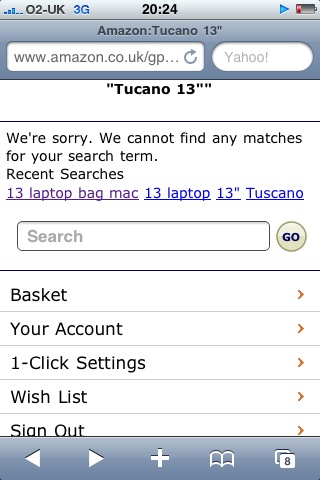
I recently bought a new Macbook Pro whilst visiting Boston (Boylston Street Apple store). Whilst there I wanted to buy a case sleeve for it. To protect my new baby of course. Unfortunately, the Apple Store’s choice was limited so decided to look at Amazon later. So while on my way home from work this week I suddenly remembered I still needed to buy my sleeve. I immediately turned to my iPhone to access amazon.co.uk.

The moment you enter the site you notice its a stripped down version of its desktop equivalent. The mobile version really impresses me, not because it loads quickly, but because of how well Amazon seems to understand context. Amazon’s mobile offering empathises with users on the go and this is where the mobile site shines.

Do I really want to start navigating a complex e-commerce site on my iPhone whilst cramped on a commuter train during rush hour? Of course not – it’s awkward and all I want to do it locate the cover sleeve and buy it. I want to use complex navigation structures to find what I’m looking for, I want to use the search (massive box) as my primary navigation – location method. And I want to be presented with an easy to read and scrollable (vertical) list of returns. Furthermore, I want to enjoy a search results page that loads quickly and allows me to explore products without accidentally touching (clicking) other links. When I’m done – found what I’m looking for – I want to be able to add that product to my basket, check out and pay.

Finally, to complete my ‘mental’ transaction (check for correct change and leave = conventional shopping experience we know and trust) I want to switch across to my email and find an email confirming my payment and order.

Here’s a run down of my user journey using my iPhone on my commuter train:

Searching for ‘Tucano 13″‘

Amazon: Search 'Tucano 13"''

Amazon: Search 'Tucano 13"''

Amazon: Search ‘nothing found’

Amazon: Search 'nothing found'

Amazon: Search 'nothing found'

Amazon: Duragadget black sleeve

Amazon: Duraskin Black

Amazon: Duragadget Black case sleeve

Amazon: Purchased

Amazon: Purchased

Amazon: 'Add to Shopping Basket'

Amazon: Order Placed

Amazon: Order Placed

Amazon: Confirm Order

Amazon: Personal Details

Amazon: Personal Details

Amazon: Personal Details

Amazon: Confirmation (thank you)

Amazon: Confirmation (thank you)

Amazon: Confirmation (thank you)

Amazon: Confirmation email

Amazon: Confirmation email

Amazon: Confirmation email

Simple Service Design

When you think about rail services (especially the ones in the UK) a common problematic theme springs to mind. Time or punctuality seems to be the hardest attribute to get right and thus the common problem theme. Our trains (in the UK) are notoriously late and delays inevitable. If an rail operator like Southern Trains can get its timing perfected or at least improved then an element of its service design is achieved right?

If you can synchronise the controllers of its service then you head one step closer to this goal. If all its on-board conductors work off the same time then there are no individual excuses. “My watch is five minutes late“, “my watch is the synch’d with BBC time“, etc… every conductor having their own time system and subsequent time issues ensues.

So, how does a railway operator like Southern Trains ensure its entire operating workforce works off synchronised timing? Simple, every conductor in its operating work force – conductors actually on the trains – are issued with a satellite/radio frequency controlled and adjusted wrist watch.

I was given a demo by an on-board instructor this morning. He showed me how by depressing a button the second hand moves around the clock face to position 12, pauses for 5 secs while it locates the universal time signal, and finally adjusts the time. There is of course a few issues with this system. One I can think of is it relies on the user to re-sync manually. An periodic self-syncing system might be a better option?

Some of the advantages of this system I’ve identified are:

1. Train despatch times are synchronised
2. Train times are consistent
3. Conductor employees receive a perk (useful item of clothing issue)
4. Marketing exercise through branded design

Amazon mobile shopping

Some online businesses just get it. Amazon, as usual, is one of those who do too. Whilst I’m sure Amazon has various business models, selling goods online (books in this case) is the obvious one.

Realising that shopping should not be restricted to the PC, Amazon built another bespoke, contextually relevant sales point – the ‘simple’ mobile device version. Building a shopping experience catering for shoppers on the go is ingenious. It seems so obvious. It’s only when you use it do you realise just how good it is. Or rather only once you use another online mobile shopping site do you realise how good Amazon’s mobile offering is.

Amazon could have (like many companies) sat back and insisted that their customers simply use their fully functioning PC version. But what kind of clunky experience would that present? Who would then want to trawl through all the page ‘noise’ while on the go? Not many I suspect.

From my mobile Amazon experience here are 5 good practices I’ve learnt:

  1. Know your users (customers)
  2. Only build what is needed
  3. Always give users alternatives
  4. Keep pages light (mobile environment)
  5. Make restarting (resetting) a session easy and available at any point.

Posted via email from Rob’s posterous

Enterprise 2.0 Conference (Boston)

Enterprise 2.0 Conference

My Enterprise 2.0 Conference schwag

One of my many roles at my company (United Business Media) is a local Community Manager. I was offered this role, in addition to my Digital Development Manager role, when I learned that our CEO wanted our company to have access to an internal wiki community – a departure from the old-school intranet we’ve always had. Since then (~12 months) I’ve being building the community trying to stimulate employee engagement and develop a community everyone can benefit from.

So when I learned that my fellow Community Manager colleagues around globe were attending the Enterprise 2.0 conference in Boston I began my pitch internally to attend. After a few attempts my CEO agreed and sent me packing.

So what exactly is Enterprise 2.0?

Enterprise‘ refers to an organisation (usually large) that is created for business ventures. Corporate establishments are enterprise in nature – usually involving thousands of employees. ‘2.0‘ gets its name from the now fashionable Web 2.0 collective – content communication tools (involving various mediums like blogs, video, audio etc…). So, Enterprise 2.0 is the exploit of web 2.0 tools within an enterprise.

The conference was amazing. Whilst technology, ROI, risk and tools were spoken about at large, I’d sum my conference experience up in three words: Community, People (including new networks) and Collaboration.

Buzz word bingo

There was a plethora of buzz words pushed around in conversation both on and off stage as strings of words were mashed together forming Social Media word-ups (buzz word mash-ups). Some attendees and speakers actually offered tangible insights, sharing useful tips and case studies examples. Dion Hinchcliffe‘s ‘Implementing Enterprise 2.0: Exploring the Tools and Techniques of Emergent Change‘ was a highlight. Dion’s session was popular with delegates forced move rooms to accommodate swelling numbers. His workshop was rather overwhelming though as he addressed the state of enterprise 2.0 and the tools being employed by companies who ‘get’ it. I soon realised that I’d needed to up the ante and decode his (and other speakers) jargon-infested ROI arguments (all valid of course). I concentrated on tangibles – the can do’semployees are social both in their social lives and at the office and business leaders need to understand this and get involved.

IT concerns

Various security vulnerabilities were discussed. IT folk focused conversations around corporate security concerns and the lack of homogeneous integration of existing information systems (like SharePoint) throughout the company.

Community heroines

In one session, Connie Bensen spoke about the benefits and features associated with online communities: lead generation, customer acquisition, retention and satisfaction. She also reminded us what makes up a successful connection between customer and you (the organisation): trust, loyalty, word-of-mouth, brand awareness and ROI.

Community relationships are based on common-sense: talking to customers and NOT at them.

She included some useful tips for success:

  1. Start with a small group
  2. Have executive sponsorship
  3. Actively interact online
  4. Engage with advocates and build relationships
  5. Incorporate ideas from the consumers
  6. Train and recruit other staff to participate
  7. Share success internally

Networking

I, like most delegates, found the networking opportunities useful. On Monday I attended a tweet-up, The Community Roundtable, meeting interesting folk (and meeting Connie). Then on Tuesday I attended another Enterprise 2.0  and An Event Apart shared tweetup meeting more great people, including David Armano briefly who I have huge respect for.

Enterprise 2.0 photostream

Enterprise 2.0 photostream

My global team mates

The Enterprise 2.0 Conference also gave me a chance to meet my fellow Community Managers. Our company Wiki Community Manager, Ted Hopton, was a panelist on the Strategies for Building Sustainable Online Communities session on Thursday. His manager and the global community management team watched on as Ted delivered ueful tips to help build communities and roll-out strategies. He also conceded that a few mistakes were made, but that was part of the learning process. What I found interesting was meeting them face-to-face after spending ~18months connecting online. The conference gave me a chance to have more meaningful conversations and tactical discussions about the future of our roles with the Wiki.